Benjamin Moore 2020 Color of the Year

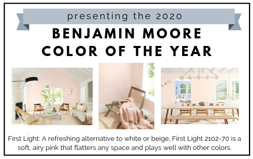
Benjamin Moore announced their 2020 Color of the Year as First Light.

“We selected this hue as the color for 2020 since it represents a new dawn of idealism, design and living,” says Andrea Magno, director of color marketing and development at Benjamin Moore. “First Light 2102-70 reflects a new definition of the home—a shift in mindset from the material thinking to satisfying the core needs in life, such as community, comfort, security, self-expression, authenticity and ultimately, optimism.”


“We’re always looking at years past and evolving,” she says. “Last year’s Metropolitan was neutral and we did that on purpose. We said, let’s a step back, relax, and find the comfort in our own homes. Once we’ve done that, we’re really ready for the next step.”

“Now, let’s use color to express ourselves, be a little more upbeat, and happy,” she concludes. “We all need that optimism in our lives.”

Watch now: See Where Benjamin Moore Tests Over 20,000 Paint Shades

It’s not too late to submit your space to Reimagined Spaces! To see how we would transform your room using First Light, email us at ReimaginedSpacesforyou@gmail.com.


Reimagined Spaces Revealing Benjamin Moore Color of the Year

Each year after extensive research and travel, Benjamin Moore selects their Color of the Year. They consider 5 elements when making their choice:

  • Design- furniture, lighting, fabrics and home accessories are well thought out while considering the relationship that paint and color has to each of them
  • Art- seeing how artists use color helps the team to see color and color pairings in a fresh new light
  • Fashion- deeply influenced by color and constantly changing, fashion is an expression of style and personality that is strongly considered
  • Environment- whether home or traveling, the team takes in all the elements surrounding landscapes, color palettes, and architectural traditions
  • Culture- entertainment, economics, consumer sentiment and contemporary culture all give voice to the annual BM color palette selection

What does this have to do with us?? We want to use the newest Benjamin Moore Color of the Year in our next Reimagined Spaces home! After the Color of the Year is announced on October 11th, we will get to work creating a home design vision board that incorporates that paint color into our design work and possibly as an accent with wallpaper, accessories, furniture or rug. Michaela will find a way to give your space new life with the 2020 Benjamin Moore Color of the Year!

If you would like to be considered for this exciting opportunity, we invite you to email us a picture of your space along with a short narrative of your dreams for that space.   If your space is chosen we will send you a short questionnaire that will allow Michaela to understand your vision, likes, dislikes and the design aesthetic that most appeals to you.  Michaela will create a design board and provide it along with links to the materials selected that compliment your space.  All reimagined spaces will be featured through this blog.

Please email us a picture of your space at reimaginedspacesforyou@gmail.com.  We look forward to transforming your space into one you love. 

Let’s get started and have some fun with design!


Hygge Home Design

Have you heard of the Hygge home design trend yet? Hygge is a Danish word that means coziness. It is a feeling more than a word- it is the ritual of enjoying life’s simple pleasures and making the ordinary more meaningful, beautiful and special. Our need to sit back, relax, and enjoy the little things has never been more strong than it is in today’s busy world. The Danish have established themselves as lovers of calm and as the happiest people of the world along with many other Scandinavian countries. It is frequently argued that this can be closely related to the concept of Hygge which is present in every aspect of Scandinavian life and design.

So how do you incorporate Hygge into your own home? Here are some elements to pay attention to:

  • Neutral Colors- Everything you add to your interior design should contribute to an atmosphere of harmony and peace. Using pastel colors like light greys, browns and creams will help promote a calm atmosphere. You can warm things up a little by adding natural, warmer tones also.
  • Use Candles- Denmark and other Scandinavian countries are rumored to be the main consumers of candles in the whole world. Candles help create an inviting atmosphere, developing a soft and more intimate form of lighting that is great for relaxation and socializing.
  • Add Texture- Soft blankets, decorative cushions and fluffy carpets can also help you enhance the sense of coziness and warmth. The Danish use a rich mixture of materials and patterns as a way of adding character and coziness to their relatively minimalist and simple interiors. They tend to introduce plenty of warm and natural materials, such as leather, wool and wood.
  • Keep It Simple- Use large mirrors strategically placed to help reflect light and brighten up dark corners. Avoid synthetic materials and rather focus on the warmth of natural wood in furniture and other elements. Remember the Scandinavian concept “less is more.”

What do you think about this design trend? If you have a room in mind that you’d like to add a touch of Hygge to, submit it to our Reimagined Spaces blog series and we create a vision board for you! Send a picture of your space to reimaginedspacesforyou@gmail.com!