
With still 8 weeks of winter left, now might be a great time to take on an indoor project that’s been on your to-do list for a while. Painting a room is something that can easily be tackled in a weekend. It is a relatively small, inexpensive update that can make a huge impact on your space. Here are the top paint colors for 2018 to give you some inspiration.
Behr’s 2018 Color of the Year is In the Moment.

“This cool, tranquil, spruce blue is inspired by nature and is a soothing, restorative coalescence of blue, gray and green. This comfortable colour evokes a sense of sanctuary and relaxation amid our busy, always-on lives. In name and colour, this hue speaks to our desire to take a break, be present and recharge. In The Moment is versatile and perfect to use for both interior and exterior projects. It also crosses multiple design styles, ideal for working with traditional, modern, coastal and global décor.”
To see Behr’s 20 trend colors for 2018, click here.
Benjamin Moore chose Caliente AF-290.
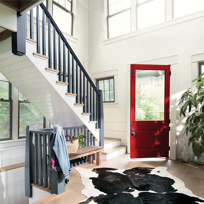
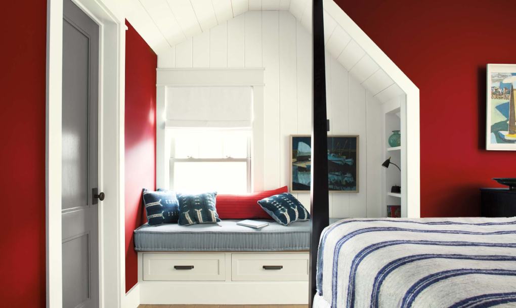
“Caliente is the signature color of a modern architectural masterpiece; a lush carpet rolled out for a grand arrival; the assured backdrop for a book-lined library; a powerful first impression on a glossy front door. The eye can’t help but follow its bold strokes. Harness the vitality.”
—Ellen O’Neill, Benjamin Moore & Co.
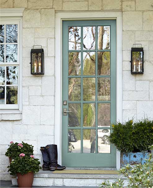
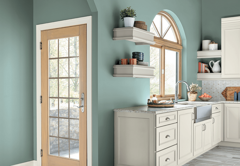
Sherwin Williams 2018 Color of the Year is Oceanside SW-696
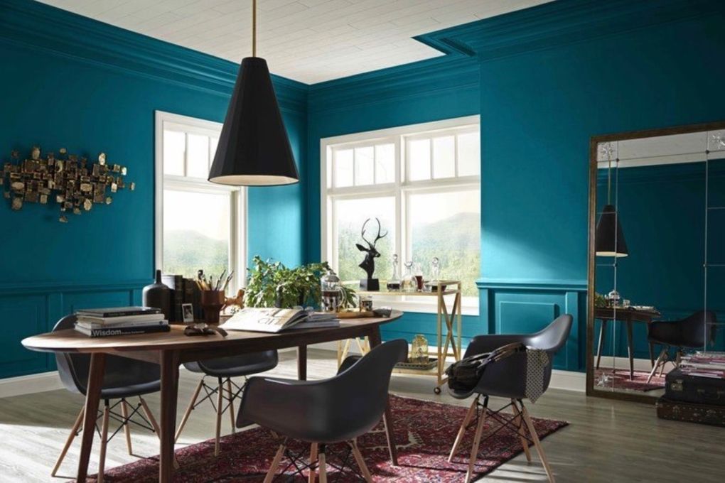
“A collision of rich blue with jewel-toned green, a color that is both accessible and elusive, Oceanside SW 6496, is our 2018 Color of the Year. A complex, deep color that offers a sense of the familiar with a hint of the unknown, Oceanside, bridges together a harmonious balance of blues and greens that can be found in what’s old and new.
The color blue evokes a multitude of moods and associations depending on hue, shade and application. Despite this variety, blues are universally perceived as intelligent, honest and interesting—making blue the most beloved color worldwide.
Oceanside’s multi-dimensional, marine-inspired look can create a welcoming statement as a lively color for a front door. Its green-meets-blue tone can also boost creative thinking and clarity of thought in a home office, or invite meditation and introspection into a bedroom or reading nook.
Oceanside is universal when it comes to design style from mid-century modern to Mediterranean-inspired, traditional to contemporary.”
Although bold, any of these colors would make a beautiful accent if you’re looking to stand out. If something more neutral and calming is on your radar, check out Benjamin Moore’s off-white collection here, Sherwin William’s Pottery Barn line here, or West Elm line here.
